.png)
PROJECT OVERVIEW
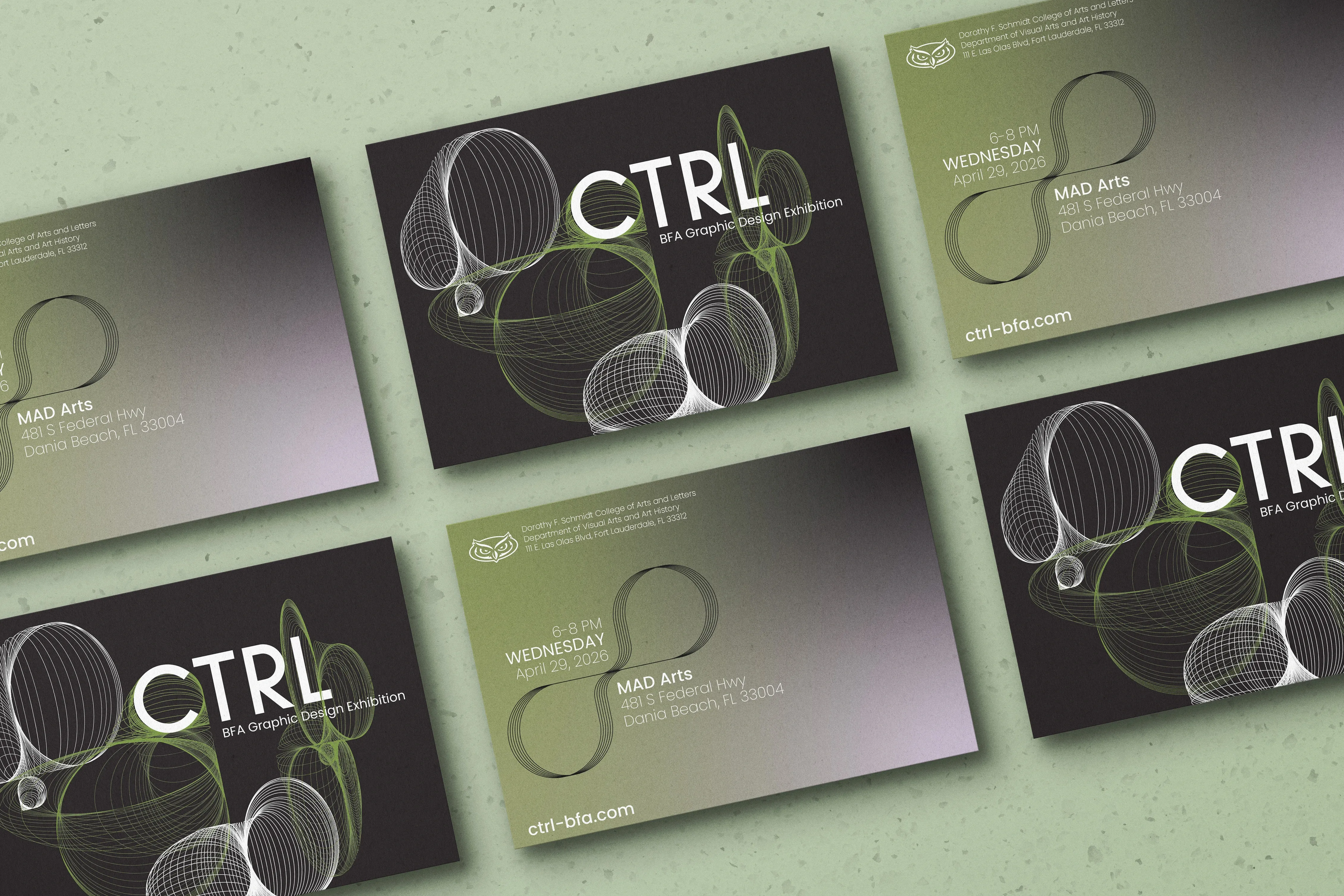
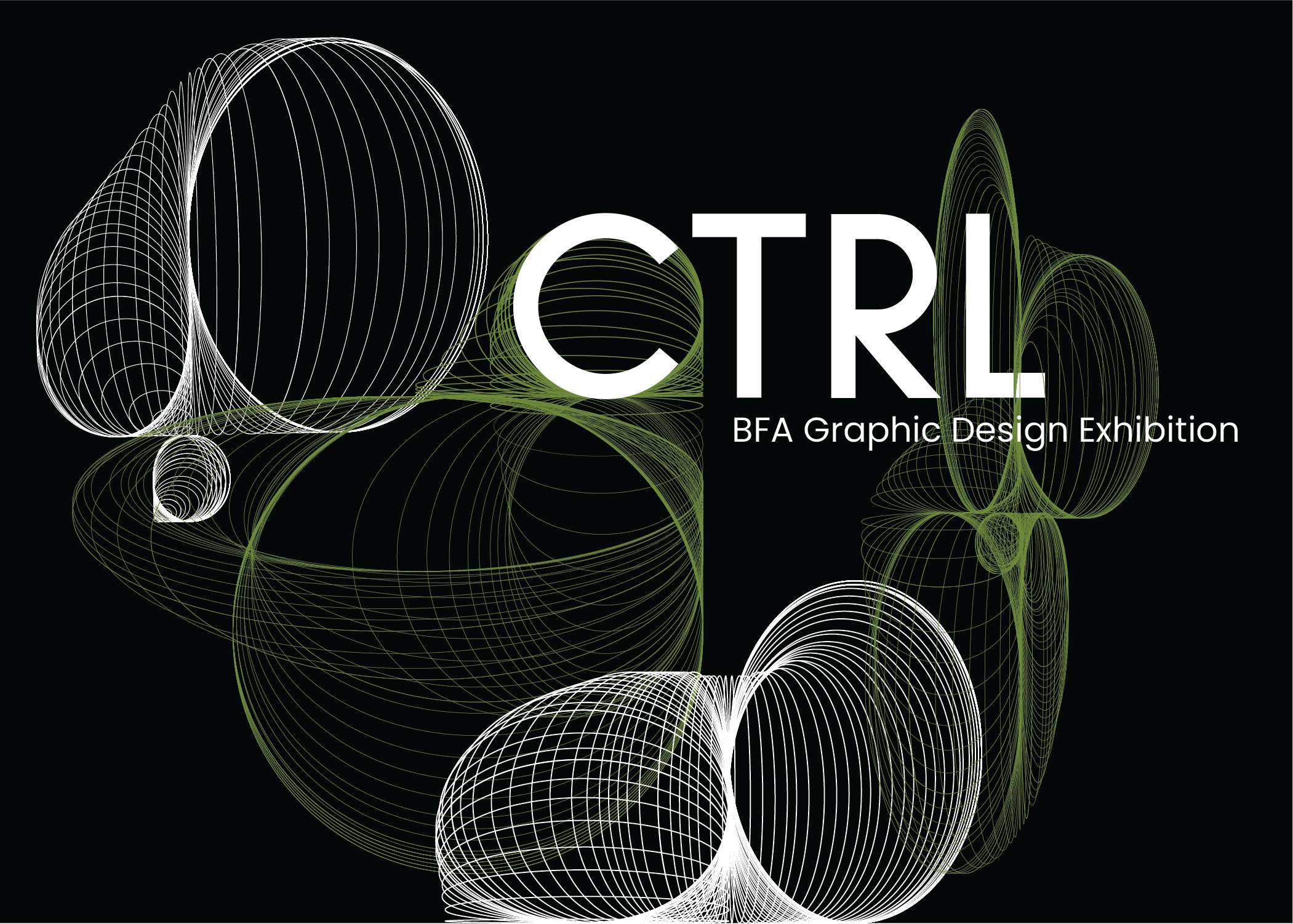
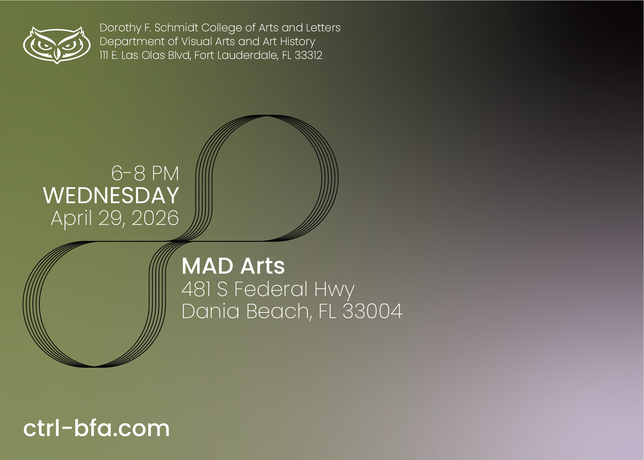
A promotional rack card design for CTRL, a Graphic Design exhibition featuring graduating seniors from FAU. The decision to maintain a 5” x 7” double-sided rectangular form was influenced by the desire to remain cost-effective and simplistic. The principal design on the front uses a blended shape effect to grab the viewer’s attention and a sans-serif font to deliver the information. The green, purple, and black gradient is meant to signify a mysterious, modern, yet somewhat edgy ambiance.
×
![new]()
STYLE GUIDE
COLOR PALETTE
Full White
- #FFFFFF
- hsl(0, 0%, 100%)
- rgb(255, 255, 255)
- cmyk(0%, 0%, 0%, 0%)
- Primary
Pure Black
- #000000
- hsl(0, 0%, 0%)
- rgb(0, 0, 0)
- cmyk(0%, 0%, 0%, 1%)
- Primary
Lizard Green
- #6D8A3A
- hsl(82, 41%, 38%)
- rgb(109, 138, 58)
- cmyk(21%, 0%, 58%, 46%)
- Primary
Tundora
- #493C48
- hsl(305, 10%, 26%)
- rgb(73, 60, 72)
- cmyk(0%, 18%, 1%, 71%)
- Secondary
Tranquil Lavender
- #CCB3CD
- hsl(298, 21%, 75%)
- rgb(204, 179, 205)
- cmyk(0%, 13%, 0%, 20%)
- Secondary
TYPOGRAPHY
-
Aa
Sulphur Point Bold
-
Aa
Poppins Medium
-
Aa
Poppins Regular
-
Aa
Poppins Extralight
PROCESS
Step 1 : Research
What is the story?
- The name of the exhibition, CTRL (pronounced Control), was chosen for its association with the Control key on a keyboard. The Control key is a modifier key, which means that to perform a function, it must be pressed alongside another key. Given that this exhibition showcases the talents of a group, the title is fitting, as it implies that teamwork is an essential component of achieving success.
Who is my audience? What is my goal?
- The primary audience is graphic design professionals (e.g. Senior Designers, Art Directors, design agency employees, etc.). The secondary audience is fellow college students, FAU alums, and the general public.
- The goal is to be attention-grabbing yet brief.
Step 2 : Design Strategy / Execution
Given the above information, this was my design strategy:
- With cost-effectiveness in mind, the card excludes excess features such as a multifold structural base, embossments, or die cuts. Instead, the card is only double-sided, measuring 5 inches high and 7 inches long.
- To avoid overcomplicating things, I developed an intriguing front design in Illustrator, creating a blended shape effect and only including the exhibition name and type. Additionally, the backside features a green-and-purple gradient background, with the remaining vital information and negative space.
- To maintain simplicity, a sans serif typeface system was used.